The lecture transcribed on the following pages critical political ã Hans-Rudolf Lutz (1939-1998): Swiss typographer, author, designer, publisher, collector, visual director and teacher took place during the Leipzig Book Fair, for which Switzerland was the guest country.ô Mirjam Fischer and Eveline Wû¥thrich organized the lecturing programme Rules & Schools on the 15th of March 2014 at the Hochschule for Graphicô Design and Book Art of Leipzig.
Sebastian Cremers & Tania Prill
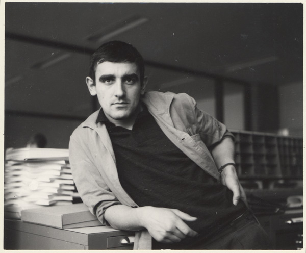
Hans-Rudolf Lutz
Hans-Rudolf Lutz began his apprenticeship as typesetterô in the long-standing company of Orell Fû¥ssli in Zû¥rich in 1955. This professionalô orientation was coincidental and he considered his working days as being monotonous.
Lutz writes the following about this period: ãI was cheeky and was almost thrown out a few times. At that time though, you didnãt need much toô get into a clinch with the boss. But they actually wanted to forbid me wearing jeans and my trendy Elvis hairdo!ã
In search of models in design he soon discovered the representatives of ãSwiss Graphic Designã, the overheard term of ãfunctionalityã meansô ãtotal reduction of the design meansã to him.
Before that, Lutz had cut his way through a four-year apprenticeship in typesetting and only survived all this time because he knew thatô afterwards, he would be able to go on ãa long tripã. He hitchhiked towards the North Cape. The three months he had planned turned into moreô than two years. He earned his living by doing cleaning in Stockholm, fine-drawing in Helsinki, typesetting in Tunis, and as a sailor and cookô assistant on different freight ships. This journey ãbroke down my creative dogmatism. I realized that intuition and systematization do notô necessarily exclude each other.ã
In 1963 Lutz began his one-year course on typographic design with Emil Ruder and Robert Bû¥chler at the vocational school in Basel. In fact,ô this course did not really exist, everything was improvisedô ãô very unswissly. Emil Ruder and Robert Bû¥chler sacrificed their breaks in order toô discuss the works and this was the first time that Lutz could concern himself with typographic design on a full time basis. In spite of all theô criticism to Emil Ruder, Lutz appreciated his implacable eye for design inconsistency.
In 1964, Lutz became the leader of the group ãexpression typographiqueã in the studio Hollenstein in Paris in order to explore and propagate theô potentials of filmsetting. In 1966 he accepts a position as teacher of typography and interdisciplinary design in Lucerne. He participated at theô creation of the F&F: School for experimental design in Zû¥rich. As of 1966, Lutz led his own studio in Zû¥rich. In the same year, he created theô publishing house Hans-Rudolf Lutz.
With a book series 3 years later, Lutz breached the 15-year boycott against the Marxist art theorist, Konrad Farner.
He became member of the music group UnknownMiX as their visual director in 1983.
Hans-Rudolf Lutz died in February 1998.
ãWieviel Erde braucht der Mensch?ã, 1971
Actor: Hans-Rudolf Lutz
Direction: Alex Sadkowsky
Production, camera, editing: Hans R. Bossert
Hello,

Puddle
Tania Prill and I will introduce to you the Swiss typographer, designer, author, publisher, visual director and teacherô Hans-Rudolf Lutz.
Together with Alberto Vieceli, we work in Hans-Rudolf Lutzãs former workshop in the Lessingstrasse in Zû¥rich.
Tania was married to Hans-Rudolf Lutz. She administrates his bequeath and manages the publishing house Hans-Rudolf Lutz.
I am also here as a publisher.
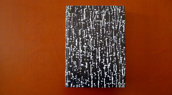
Hans-Rudolf Lutz’s workshop
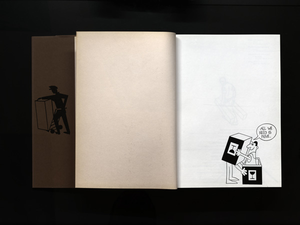
Half a year ago I initiated ãeveryeditionã and would like to present this new edition of the publication ãThe Miami Heraldã by Hans-Rudolf Lutz, revised by Tania and myself, as well as the book ã336 pages 336 booksã by Tania, Alberto and me which reveals ties with Hans-Rudolfô Lutzãs work, as well as to books as such.
On the basis of several projects, we will show you how Hans-Rudolf Lutz worked. We especially focus on the manifold interconnectionsô between word and picture in his work. Furthermore we would like to confront some of his works with projects that emerged independentlyô from Lutz and created a contentual tie that can widen the angle of view.
These correlations will also play a role in the exhibition on Hans-Rudolf Lutz that we are currently working on.
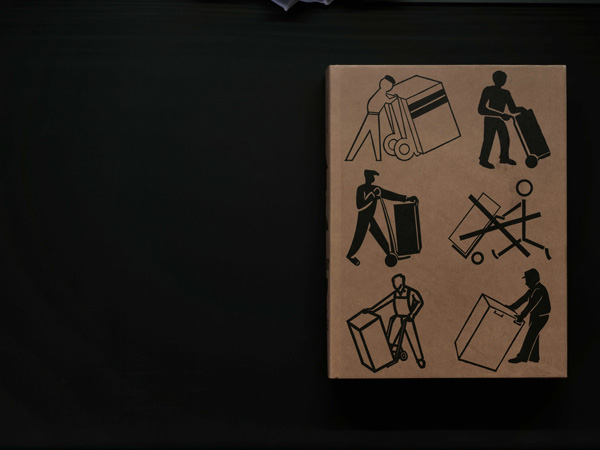
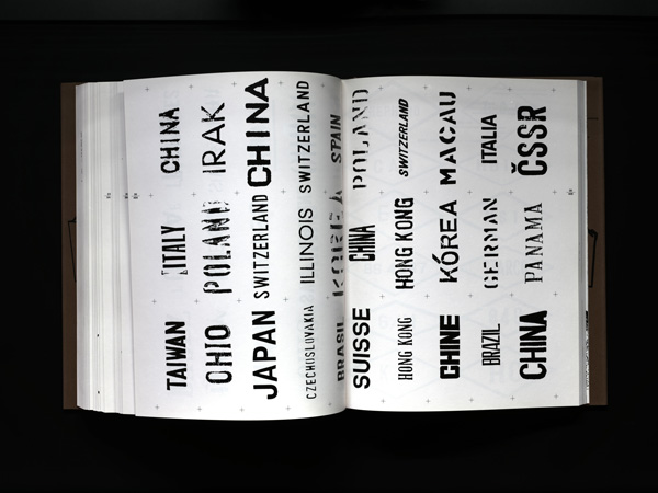
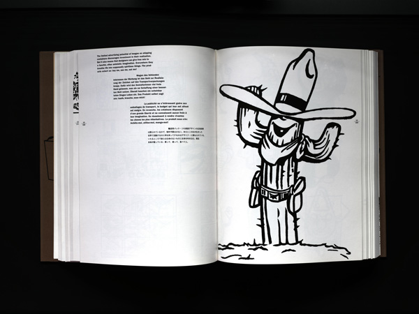
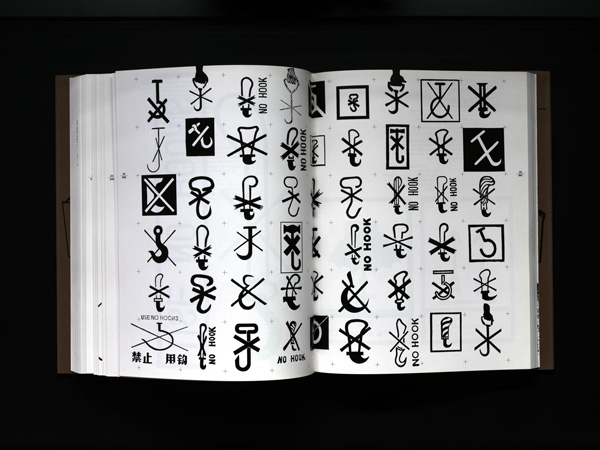
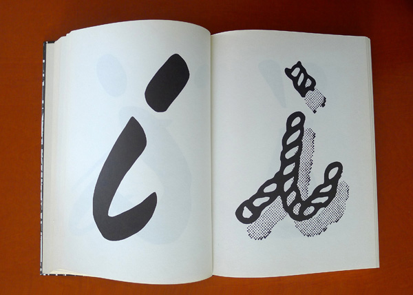
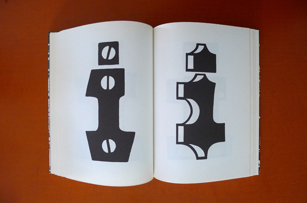
ãTodayãs Hieroglyphsã
Hans-Rudolf Lutz’s collection of signs
Hans-Rudolf Lutz describes the project as follows:
ãFor 15 years I have been digging in trash piles of this world and end up promoting 15,000 of these visual treasures to be seen.ã
Here you see a part of his collection that Lutz transformed in the repro-machine of the school in Lucerne SW.
5,000 of these signs were included in this book.
ãTodayãs Hieroglyphsã
Hans-Rudolf Lutz
528 pages, 22 x 29,4 cm
Verlag Hans-Rudolf Lutz, 1990
ãTodayãs Hieroglyphsã
Hans-Rudolf Lutz
528 pages, 22 x 29,4 cm
Verlag Hans-Rudolf Lutz, 1990
ãTodayãs Hieroglyphsã
Hans-Rudolf Lutz
528 pages, 22 x 29,4 cm
Verlag Hans-Rudolf Lutz, 1990
ãTodayãs Hieroglyphsã
Hans-Rudolf Lutz
528 pages, 22 x 29,4 cm
Verlag Hans-Rudolf Lutz, 1990
ãTodayãs Hieroglyphsã
Hans-Rudolf Lutz
528 pages, 22 x 29,4 cm
Verlag Hans-Rudolf Lutz, 1990
ãTodayãs Hieroglyphsã
Hans-Rudolf Lutz
528 pages, 22 x 29,4 cm
Verlag Hans-Rudolf Lutz, 1990
ãTodayãs Hieroglyphsã
Hans-Rudolf Lutz
528 pages, 22 x 29,4 cm
Verlag Hans-Rudolf Lutz, 1990
ãTodayãs Hieroglyphsã
Hans-Rudolf Lutz
528 pages, 22 x 29,4 cm
Verlag Hans-Rudolf Lutz, 1990
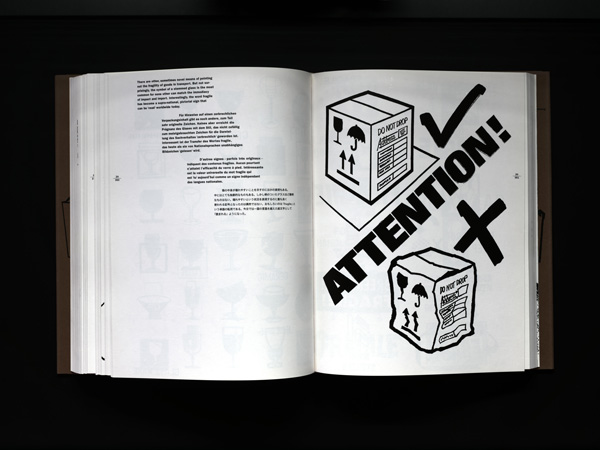
The signs on the corrugated cardboard packaging for transport are signs made by workers for workers.
Workmen and workwomen with only little design education allow these signs to keep a great pictorial value. Hans-Rudolf Lutz dedicated hisô book to them.
In spite of the reduction to the essentials, they are capable of introducing sensitivity, surprise and also a high informational value in their signs.
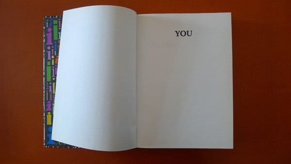
ãYOU ã 405 (406)ã,ô Ann Noû¨l
ãYou ã 405 (406)ã
Ann Noû¨l
Edition of 130 copies
published by Rainer Verlag Berlin, 1982
As a first correlation to ãTodayãs Hieroglyphsã, we will show you the artists book ãYOU ã 405(406)ã by Ann Noû¨l, published in 1982 in anô edition of 130 copies. The artist lives and works in Berlin and was active in the Fluxus movement.
The book refers to the Me-Generation in the 70ãs in the USA. Ann Noû¨l lived in the States at the time.
ãYou ã 405 (406)ã
Ann Noû¨l
Edition of 130 copies
published by Rainer Verlag Berlin, 1982
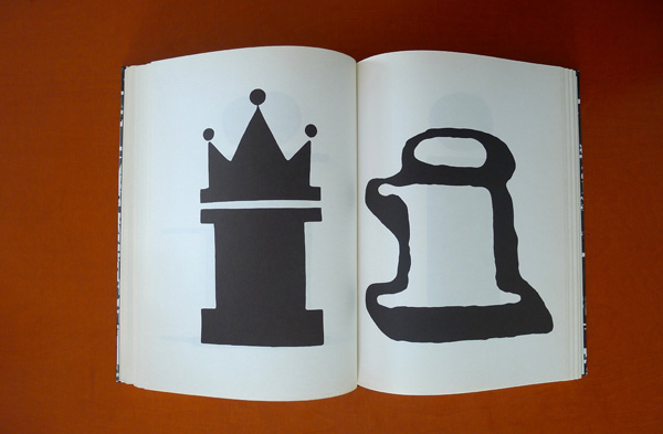
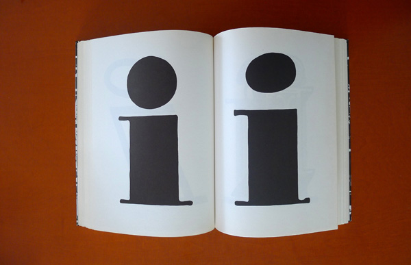
Whereas Hans-Rudolf Lutz shows the design diversity of ãunprofessionalã workmen and workwomen in his book ãTodayãs Hieroglyphsã, theô exciting thing about this correlation is
ãYou ã 405 (406)ã
Ann Noû¨l
Edition of 130 copies
published by Rainer Verlag Berlin, 1982
that Ann Noû¨lãs concern in her book is the expressive diversity of one artist, namely of her own person.
ãYou ã 405 (406)ã
Ann Noû¨l
Edition of 130 copies
published by Rainer Verlag Berlin, 1982
For this purpose she limited herself to one letter that also mutates to an image or rather a hieroglyph through its 405 variants.
ãYou ã 405 (406)ã
Ann Noû¨l
Edition of 130 copies
published by Rainer Verlag Berlin, 1982
ãYou ã 405 (406)ã
Ann Noû¨l
Edition of 130 copies
published by Rainer Verlag Berlin, 1982
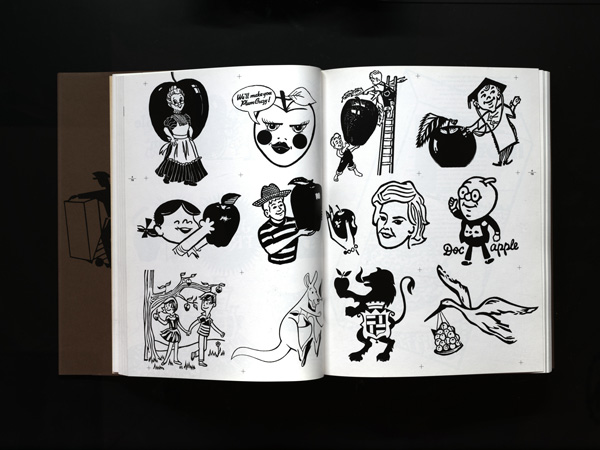
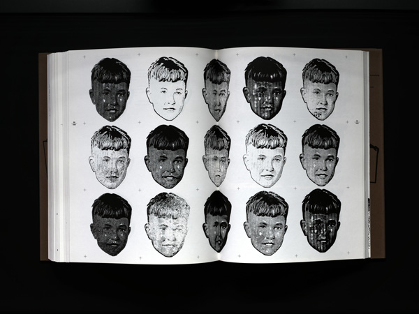
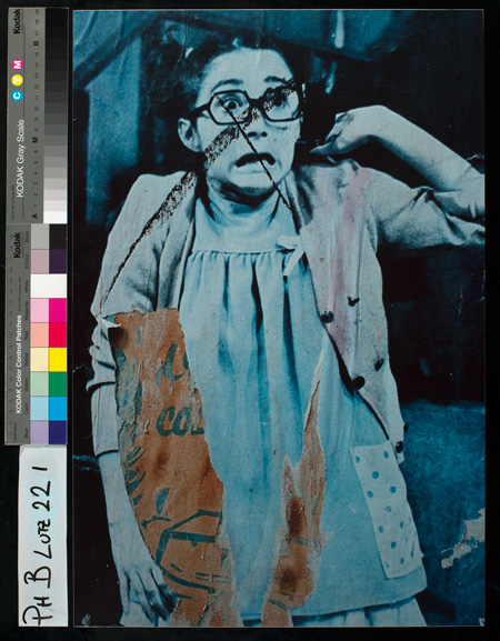
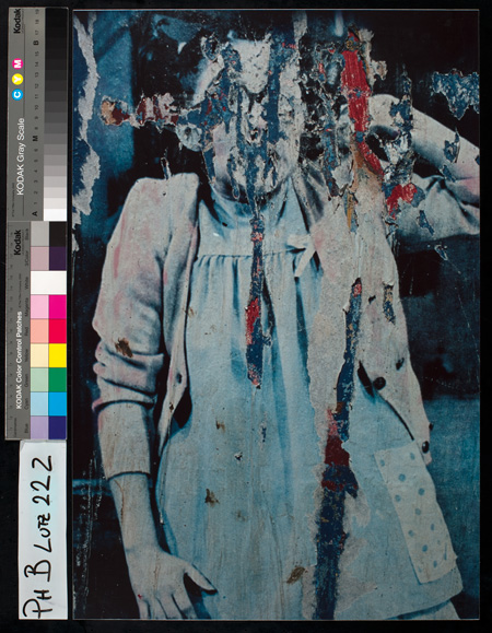
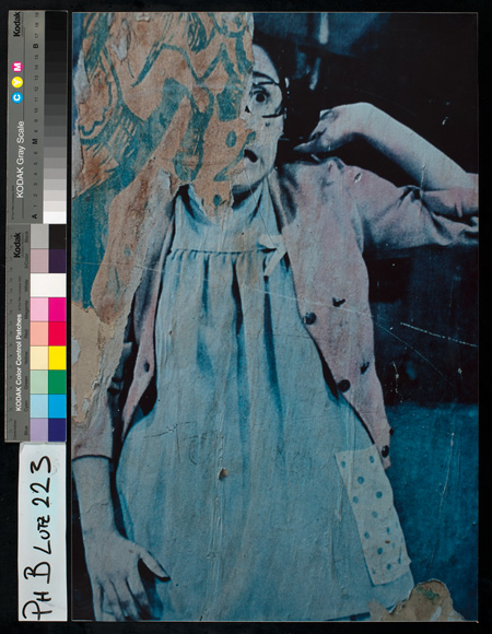
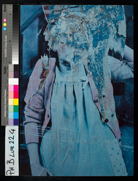
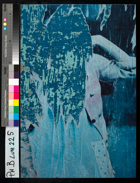
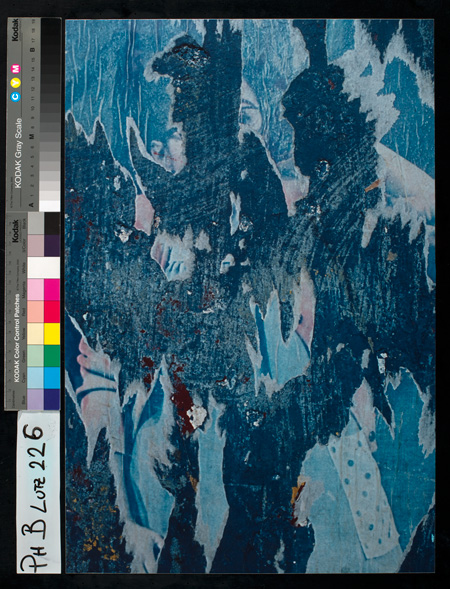
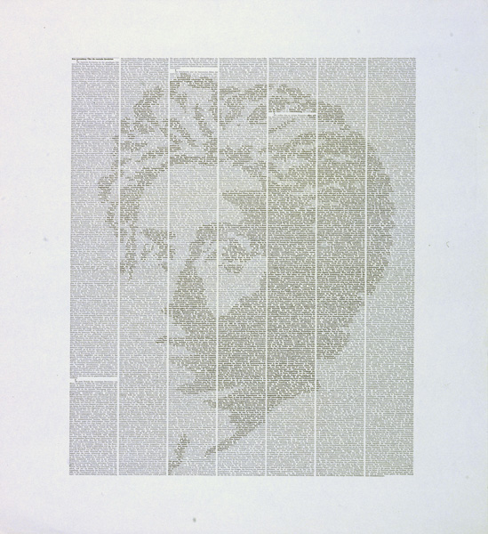
ô ãDie Fixierung auf einenô Zustand ist immerô nur vorlûÊufigã
With the following series, Hans-Rudolf Lutz wanted to show that the designing process is not completed, when for example a poster has goneô through the printing machine.
Quotation:
ãFixation on one state is always just temporary. This knowledge relativises the meaning of our work, without making it insignificantô or arbitrary.
Typographic design unifies just as much the permanent ãcreation of orderã as the ãliking of disorderlinessã. What is fascinating is that this isô not contradictory.
Exposure e.g. to nature (sun, rain, wind, decay) and to people by scratching, scribbling, tearing off, drawing over and commenting transformsô a series of the same to a series of changing ones.ã
ãDie Fixierung auf einen Zustand ist immer nur vorlûÊufigã
ãDie Fixierung auf einen Zustand ist immer nur vorlûÊufigã
ãDie Fixierung auf einen Zustand ist immer nur vorlûÊufigã
ãDie Fixierung auf einen Zustand ist immer nur vorlûÊufigã
ãDie Fixierung auf einen Zustand ist immer nur vorlûÊufigã
ãDie Fixierung auf einen Zustand ist immer nur vorlûÊufigã
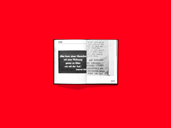
ô Writing > grid > picture > portrait of Karl Marx
ãWriting > grid > picture > portrait of Karl Marxã
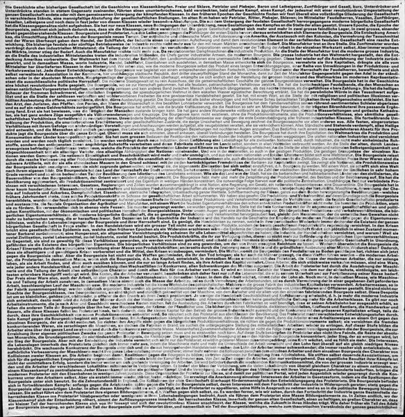
In the 1960s Lutz was inspired by Wittgenstein to use language as a virtual material and thus open it to meanings. A continuation of this ideaô is the work ãWriting > grid > picture > portrait of Karl Marxã. Lutz comments it: ãEven if we have got used to the separation of text and pictorialô information, we could make the border between them more permeable.ã
With the statement following a short introduction, ãThe history of all previous societies has been the history of class strugglesã Karl Marx andô Friedrich Engels begin the first chapter of the Manifesto of the communist party.
Johannes Gachnang, artist, curator and publisher comments this in an interview with Jean Widmer in 2000:ô ããTypography is politicalã ã somehow that was already true. We too, were once young communists and this or that. At some point in time, weô were always excluded, because of Trotzkist activities, Maoist activities, we were simply anarchists. Lutzãs poster revealing Marx through theô type face of the communist manifesto is an attempt to visualize something. The text and the person are blended together in a very naive way.ô When you take into account the countless copies of this: a master stroke.ã
ãWriting > grid > picture > portrait of Karl Marxã
Socialist graphic design is one of Lutzãs sources of inspiration. (ãÎ) He endeavoured to keep his own strict canon in movement throughô imports and departures.
How can Protestantism be loosened in visual communication and saved over time? Not just any good form can save mankind, but ratherô renewal. It is not a concern about style, but about coordinates. When Lutz wanted to cooperate with advertisers, he was branded as a traitor.
I think Lutz was very serious in his attempt to deal with the given material. (ãÎ) He constantly researched on how you can bring a text or aô context or an idea into the picture.
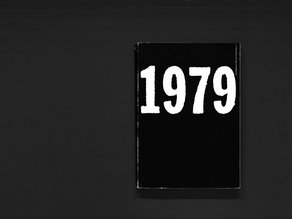
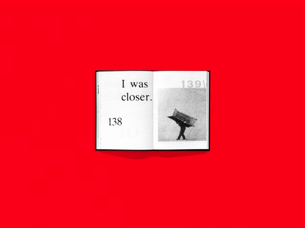
1979
1979 by Hans-Rudolf Lutz is an experimental proposal in this direction.
Fritz Billeter says to this project:ô ãNo other media reports just as well the great and the petty world history all mixed as the daily newspaper.ô History books? They separate history from the here and now of our everyday life. More sensitive and instructive forms of history writingô would induce much more of an active discussion about it, and this on rational and an emotional level. (…)ã
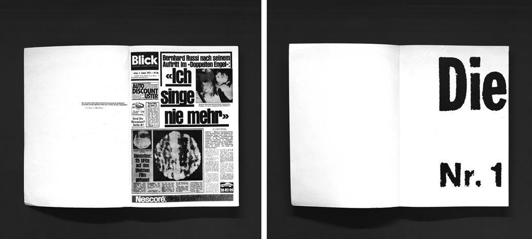
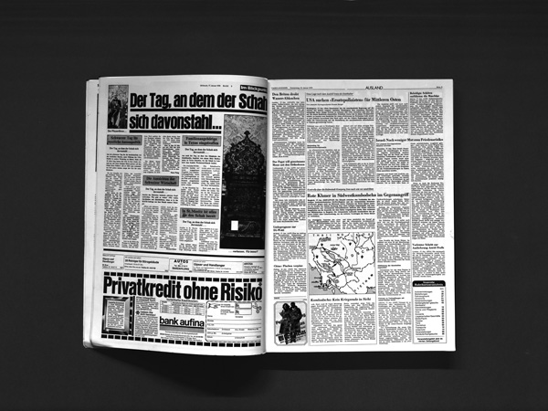
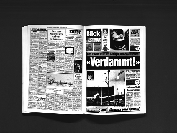
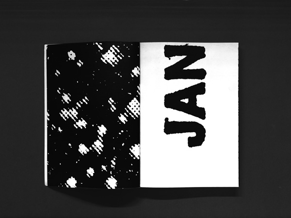
The idea behind 1979 is simple: for every workday of the year, one page of a daily Swiss newspaper has been reproduced, showing eventsô of local and international political significance. That makes up the first volume, here on the left.
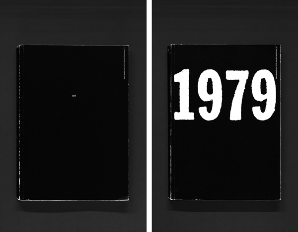
ã1979, Eine Art Geschichteã
2 volumes, 312 pages each
brochure, 20,8 x 29,4 cm
Verlag Hans-Rudolf Lutz, 1980
Volume 2: A 10 x 15 mm section has been cut out of each of these pages and enlarged to fill the book format of 208 x 294 mm, as you canô see on the right hand side.
ã1979, Eine Art Geschichteã
2 volumes, 312 pages each
brochure, 20,8 x 29,4 cm
Verlag Hans-Rudolf Lutz, 1980
We will first of all show you spreads from Volume 1:
ã1979, Eine Art Geschichteã
2 volumes, 312 pages each
brochure, 20,8 x 29,4 cm
Verlag Hans-Rudolf Lutz, 1980
ã1979, Eine Art Geschichteã
2 volumes, 312 pages each
brochure, 20,8 x 29,4 cm
Verlag Hans-Rudolf Lutz, 1980
ã1979, Eine Art Geschichteã
2 volumes, 312 pages each
brochure, 20,8 x 29,4 cm
Verlag Hans-Rudolf Lutz, 1980
ã1979, Eine Art Geschichteã
2 volumes, 312 pages each
brochure, 20,8 x 29,4 cm
Verlag Hans-Rudolf Lutz, 1980

ã1979, Eine Art Geschichteã
2 volumes, 312 pages each
brochure, 20,8 x 29,4 cm
Verlag Hans-Rudolf Lutz, 1980
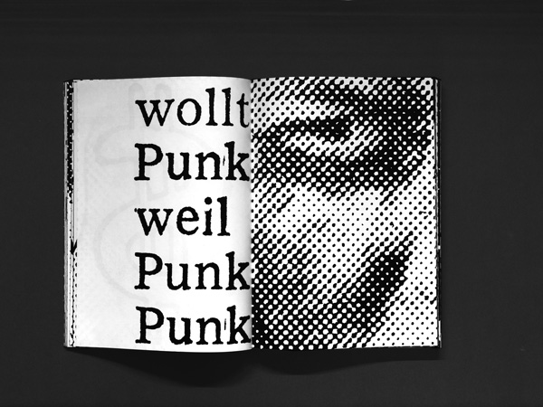
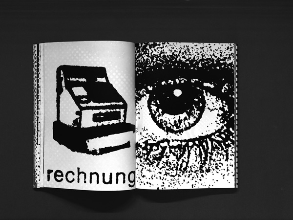
Volume 2: The clippings have not been selected at random. Theyô are meant to offer a visual commentary on the largely verbal news inô the first volume. The outcome is volume two and also a history of the year 1979: ãa story in signs and pictures.ã
By isolating and enlarging, what is missing in Volume 1 takes on a substantially different appearance and other formal characteristics.
ã1979, Eine Art Geschichteã
2 volumes, 312 pages each
brochure, 20,8 x 29,4 cm
Verlag Hans-Rudolf Lutz, 1980
It tends to be more vivid
ã1979, Eine Art Geschichteã
2 volumes, 312 pages each
brochure, 20,8 x 29,4 cm
Verlag Hans-Rudolf Lutz, 1980
provokes associations,
ã1979, Eine Art Geschichteã
2 volumes, 312 pages each
brochure, 20,8 x 29,4 cm
Verlag Hans-Rudolf Lutz, 1980
completes,

ã1979, Eine Art Geschichteã
2 volumes, 312 pages each
brochure, 20,8 x 29,4 cm
Verlag Hans-Rudolf Lutz, 1980
emphasizes
ã1979, Eine Art Geschichteã
2 volumes, 312 pages each
brochure, 20,8 x 29,4 cm
Verlag Hans-Rudolf Lutz, 1980
or changes, what in Volume 1 still seemed to be understood as a logical meaning.
ã1979, Eine Art Geschichteã
2 volumes, 312 pages each
brochure, 20,8 x 29,4 cm
Verlag Hans-Rudolf Lutz, 1980
ãWhile we tend to have a better grasp of visual and textual relations in volume 1, volume 2 gives us more insight into structures and pictorialô signs that signalize something, that appeal to or even assault the emotions.ã Fritz Billeter
Peter Rautmann, Professor for theory and history of aesthetic practices and former dean of the Hochschule of Arts Bremen, wrote to Lutz inô 1986:
ãThis is in my mind a quality of your history book, that it constantly leads us to think about the basic aesthetic-philosophical problems of ourô existence.
How can a current event be qualified, how can we find our way around in the world of events, in this original chaos, how does the small,ô seemingly peripheral detail relate to the whole, what criteria can we accept for ourselves, how can we assert ourselves as subjects in thisô ãoceanã of happenings.ã
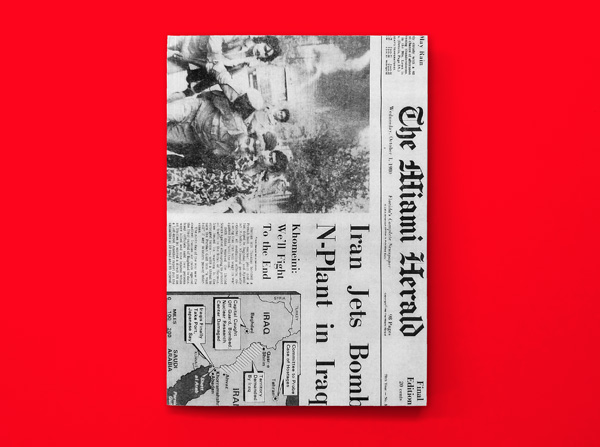
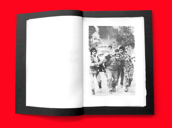
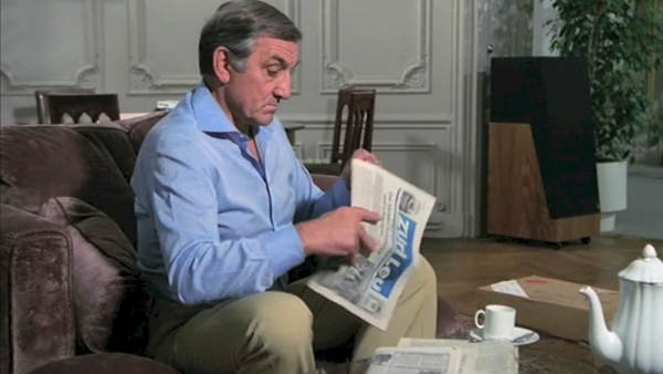
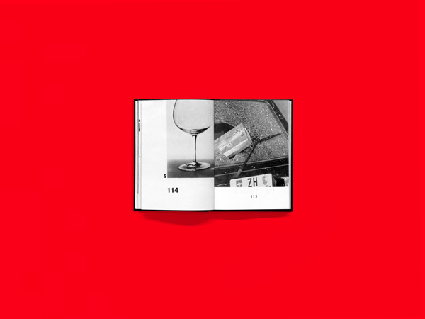
ãThe Miami Herald,ô Wednesday, October 1, 1980ã

ãThe Miami Heraldã
Hans-Rudolf Lutz
Wednesday, October 1, 1980
Reissue of originally 8 books published by Hans-Rudolf Lutz, Zurich, 1980
First edition of 80
ôˋ everyedition, Zurich, 2013
We will now present the project ãThe Miami Heraldã by Hans-Rudolf Lutz.
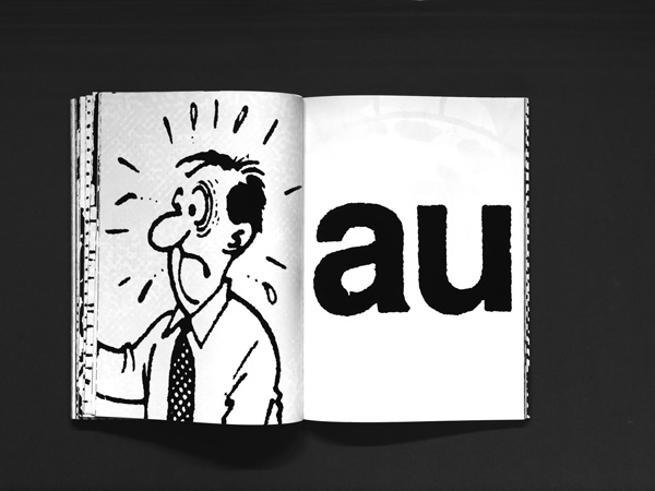
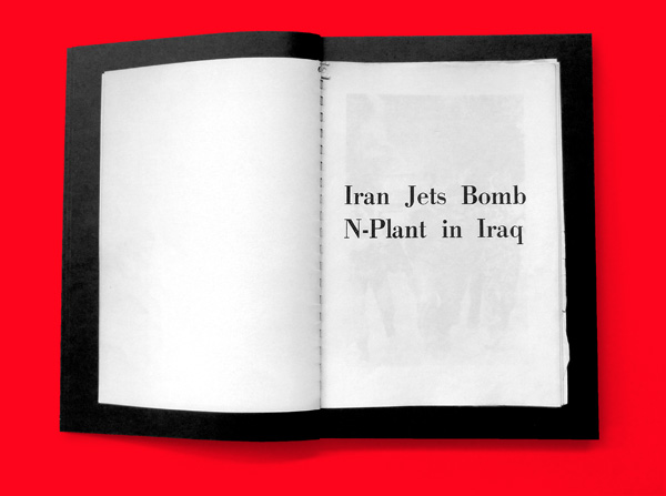
The model Hans-Rudolf Lutz used for this project was the 1 October 1980 issue of ãThe Miami Heraldã, out of which he cut a text with aô contentually associated picture and then assembled them behind each other. The order of the printed pairs of text and picture corresponds toô their order in the newspaper.
We reissued ãThe Miami Heraldã this year, which has just been published by everyedition.
ãThe Miami Heraldã
Hans-Rudolf Lutz
Wednesday, October 1, 1980
Reissue of originally 8 books published by Hans-Rudolf Lutz, Zurich, 1980
First edition of 80
ôˋ everyedition, Zurich, 2013
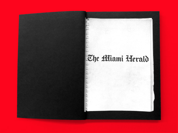
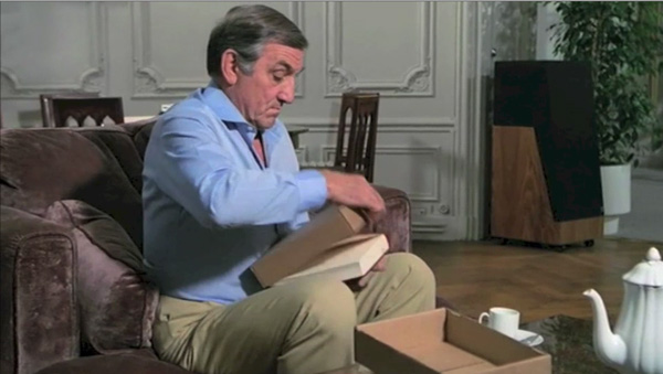
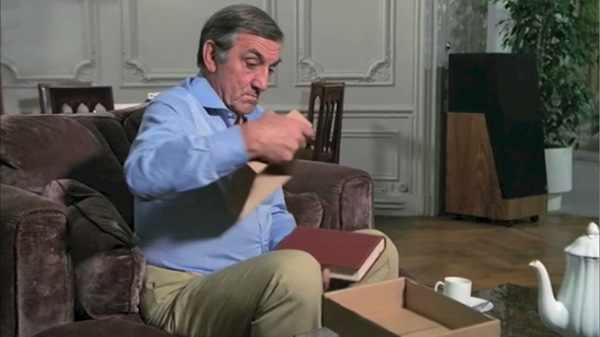
This new edition shows the only to our knowledge existing and quite battered original as a book in the book.
ãThe Miami Heraldã
Hans-Rudolf Lutz
Wednesday, October 1, 1980
Reissue of originally 8 books published by Hans-Rudolf Lutz, Zurich, 1980
First edition of 80
ôˋ everyedition, Zurich, 2013
Lutzãs first edition consisted of 8 copies, we have limited the new edition to 80 copies.
ãThe Miami Heraldã
Hans-Rudolf Lutz
Wednesday, October 1, 1980
Reissue of originally 8 books published by Hans-Rudolf Lutz, Zurich, 1980
First edition of 80
ôˋ everyedition, Zurich, 2013
The ãMiami Heraldã represents to us one of his most radical projects.
ãThe Miami Heraldã
Hans-Rudolf Lutz
Wednesday, October 1, 1980
Reissue of originally 8 books published by Hans-Rudolf Lutz, Zurich, 1980
First edition of 80
ôˋ everyedition, Zurich, 2013
Lutz brings the concept to the point with this short and concise statement: ãUsing a verbal message to announce a visual one.ã
ãThe Miami Heraldã
Hans-Rudolf Lutz
Wednesday, October 1, 1980
Reissue of originally 8 books published by Hans-Rudolf Lutz, Zurich, 1980
First edition of 80
ôˋ everyedition, Zurich, 2013

ãThe Miami Heraldã
Hans-Rudolf Lutz
Wednesday, October 1, 1980
Reissue of originally 8 books published by Hans-Rudolf Lutz, Zurich, 1980
First edition of 80
ôˋ everyedition, Zurich, 2013
ãThe Miami Heraldã
Hans-Rudolf Lutz
Wednesday, October 1, 1980
Reissue of originally 8 books published by Hans-Rudolf Lutz, Zurich, 1980
First edition of 80
ôˋ everyedition, Zurich, 2013
ãThe Miami Heraldã
Hans-Rudolf Lutz
Wednesday, October 1, 1980
Reissue of originally 8 books published by Hans-Rudolf Lutz, Zurich, 1980
First edition of 80
ôˋ everyedition, Zurich, 2013
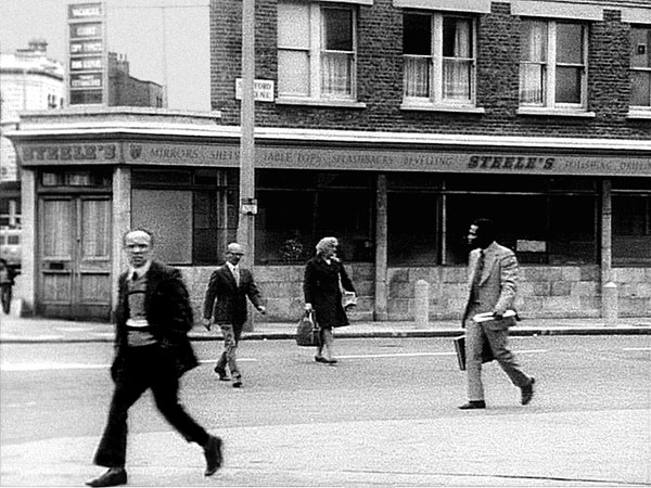
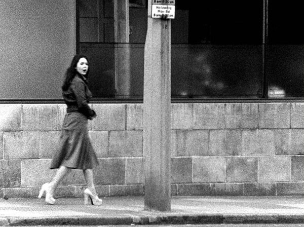
ãThe Girl Chewing Gumã,ô John Smith
By the following correlation, the film ãThe Girl Chewing Gumã, which was created at about the same period as ãThe Miami Heraldã, the artistô John Smith also addresses the temporal relation between verbal and visual messages.
Unfortunately, we cannot show you this 12-minute avant ãgarde film in its full length.
In ãThe Girl Chewing Gumã, a commanding voice seems to be directing the happenings of a busy London street. As the film goes along, theô orders become more and more absurd and we realize, that the alleged film director is merely a fictitious film director. The scenes do notô comply with the voice, but the opposite.
ãSmith embraced the ãspectre of narrativeã […] to play word against picture and chance against order.ã
A. L. Rees, 1995
ãThe Girl Chewing Gumã
John Smith
(1976) 12 mins, B/W, Sound, 16 mm
ãThe Girl Chewing Gumã
John Smith
(1976) 12 mins, B/W, Sound, 16 mm
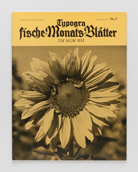
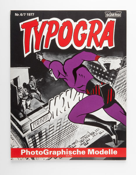
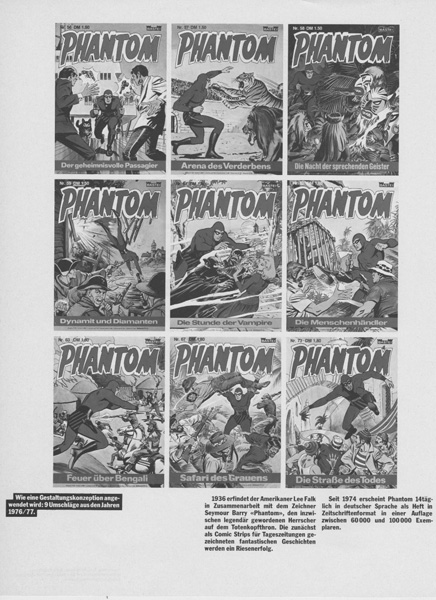
ãTMã
Another very well known work by Hans-Rudolf Lutz concerning the relation between word and picture are the covers for the Swiss magazineô ãDie typografischen MonatsblûÊtterã.
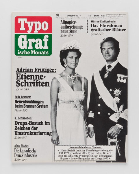
TM
By the covers for the TMãMagazine, Lutz wanted to show that the visual message of plagiarized design concepts momentarily usurps the verbalô message of the text.
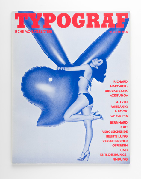
TM
In 1977, 12 plagiarizations are published ofô Schweizer Illustrierte, the Tages-Anzeiger-Magazin, Gelbes Heft, Pop, Fix und Foxi,ô Beobachter, Phantom, Neue Post, Elle, Der Spiegel, Time and Playboy.
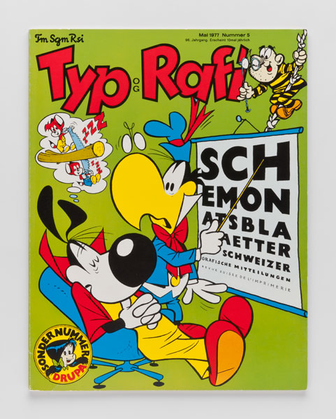
TM
Looking back at his apprenticeship as a typesetter, Lutz writes: ãthe Typografischen MonatsblûÊtter have a good reputation and regularlyô provide food for controversy. Especially the special issues on ãSwiss designã are very controversial among the typesetters. The bosses are quiteô generous when it comes to participation in TM-competitions and authorize the use of the setting equipment beyond working hours.ã
TM
Albert Kapr, typographer and calligrapher, author and up until the 80ãs professor for writing and book design here at the Hochschule for designô and book art comments:
ãThe rule seems to be that you can ignore the figurative aspect of writing when you are reading, that only the ideas that we read sink in; yetô the shape of the letters and their typographic arrangement operate unconsciously upon the reception of the ideas that are loaded onto the visualô shapes, they can weaken or strengthen their effect.ã
TM
TM
At the beginning of the work on the TM covers Lutz writes to numerous magazine publishers asking them to support him in this project. Heô requested past issues, in order to examine the application of the design concept.
With computers, word and image are produced by the same machine for the first time. The crossovers between the media have thus becomeô much more fluent.
ãThat could also mean: ranking the ãverbal legibilityãô after the ãvisual legibilityã and as such building upon the expressiveness of the form andô not the content of the signs.ã
Hans-Rudolf Lutz, 1991
TM
This information, as well as figures and facts about the number of copies, diffusion, etc. and also the comparison to competing products areô shown by him on a spread in each respective TM-Magazine.
TM
For this TM-Cover concept, Lutz had to ask several publishing houses for permission to plagiarize their design concept. This was mostô certainly a difficult undertaking knowing that all the major and successful publishers dispose of legal departments, who are schooled to wardô off plagiarizing attempts.
The publishing director of the Spiegel, for instance, started off by refusing the permission with the reasoning that it is legally not defendable toô authorize some to plagiarize and forbid it to others.
TM
ãEspion, lû´ve-toiã, 1982
ãEspion, lû´ve-toiã, 1982
Director: Yves Boisset
ãEspion, lû´ve-toiã, 1982
Director: Yves Boisset
ãEspion, lû´ve-toiã, 1982
Director: Yves Boisset
ãEspion, lû´ve-toiã, 1982
Director: Yves Boisset
ãEspion, lû´ve-toiã, 1982
Director: Yves Boisset
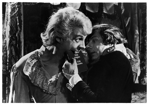
ô ã336 pages 336 booksã, Tania Prill, Alberto Vieceli, Sebastian Cremers, everyedition, 2013
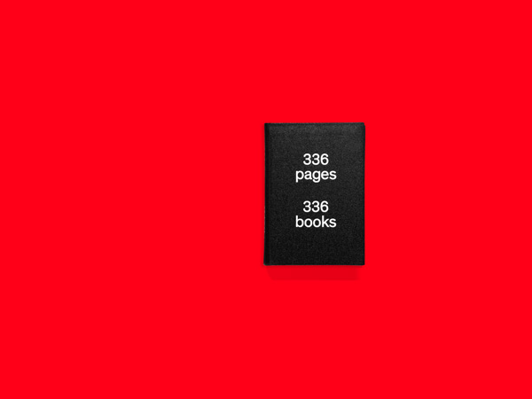
ã336 pages 336 booksã
Tania Prill, Alberto Vieceli, Sebastian Cremers,
everyedition, 2013
The last project that we are presenting today is not by Hans-Rudolf Lutz, but a book by Alberto, Tania and myself, that has just been edited byô everyedition.

ã336 pages 336 booksã
Tania Prill, Alberto Vieceli, Sebastian Cremers,
everyedition, 2013
Tania, Alberto and I work together for our commissioned work as well as for our self-initiated projects.
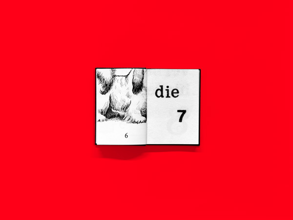
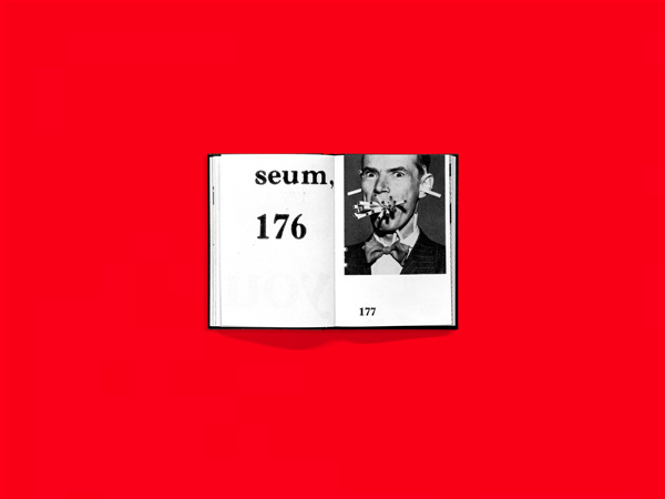
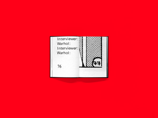
For this 336-page book we have sighted thousands of books of all different periods, on different topics and focuses, in search of 336ô headstrong, incorruptible and humoristic page numbers.
ã336 pages 336 booksã
Tania Prill, Alberto Vieceli, Sebastian Cremers,
everyedition, 2013
ã336 pages 336 booksã
Tania Prill, Alberto Vieceli, Sebastian Cremers,
everyedition, 2013
On one spread, 2 pagings face each other, they relate to each other by their setting. The entirety of the pages reflects the visual diversity of theô world of books.
ã336 pages 336 booksã
Tania Prill, Alberto Vieceli, Sebastian Cremers,
everyedition, 2013
The inspiration for this project comes from all sorts of directions.
ã336 pages 336 booksã
Tania Prill, Alberto Vieceli, Sebastian Cremers,
everyedition, 2013
The dramatic composition and the structure of our book refer to the wonderful book by George Brecht: ãbookã, which addresses theô phenotype of books in a self-referring approach.
ã336 pages 336 booksã
Tania Prill, Alberto Vieceli, Sebastian Cremers,
everyedition, 2013
The title is inspired by the artist books by Ed Ruscha. His book titles often describe the content.
ã336 pages 336 booksã
Tania Prill, Alberto Vieceli, Sebastian Cremers,
everyedition, 2013
The underlying idea to ã336 pages 336 booksã originated when reading page 243 of Bram Stokerãs ãDraculaã, (1967).
ã336 pages 336 booksã
Tania Prill, Alberto Vieceli, Sebastian Cremers,
everyedition, 2013
A leaflet with the index of the source references is enclosed in the book.
ã336 pages 336 booksã
Tania Prill, Alberto Vieceli, Sebastian Cremers,
everyedition, 2013
With this project, the reissue of ãThe Miami Heraldã and this lecture, we would like to open and revive the Hans-Rudolf Lutz archive. Even ifô we work under different circumstances with our own studio, our teaching and publishing activities, Hans-Rudolf Lutz influences our practiceô by his work and his posture.
Thank you.
everyedition.ch verlag-lutz.ch Copyright for the images ôˋ Tania Prill, Verlag Hans-Rudolf Lutz